Work Thoughts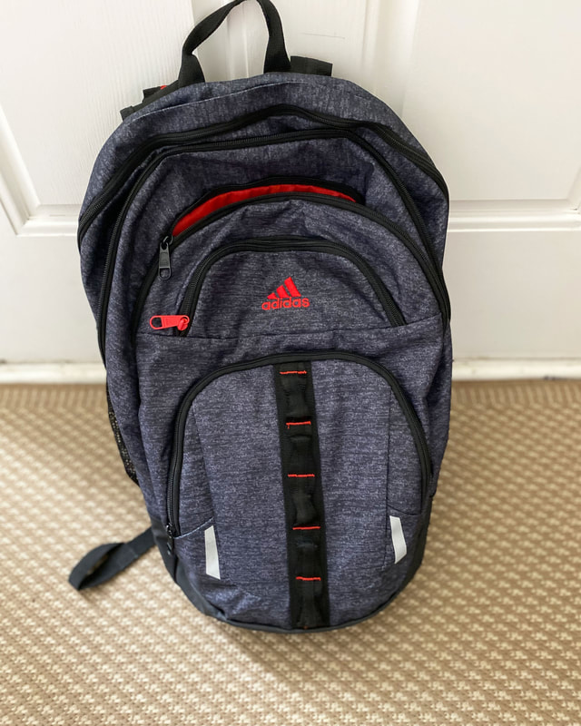
|
Slumped Day
|
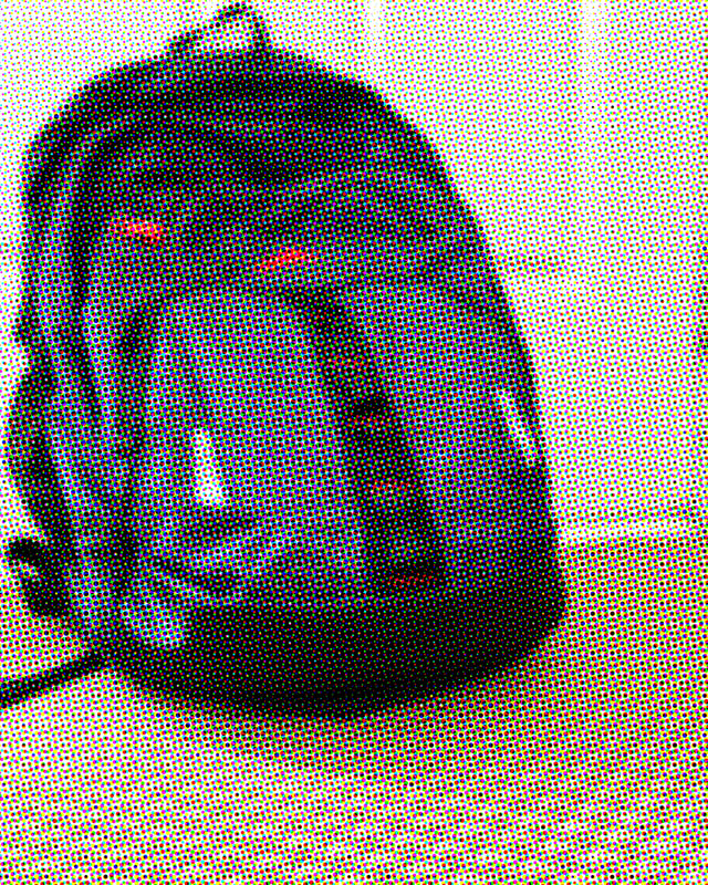
This is the artist statement for the backpack above. This backpack is new his school year and has been holding up. Even though that it hold a lot of weight throughout the day. I took this by the front door since I drop it off after school on a chair near it. It looks nice since it is close to neutral colors allowing it to pop out. I like both angles I used for the photos but I prefer the first one only because it shows more detail of the zippers and texture. This was not my ideal pixelation technique since it showed the red, green, and blue that goes with coding colors. I am excited to see how it will hold up throughout high school.
Cold...Cold...Home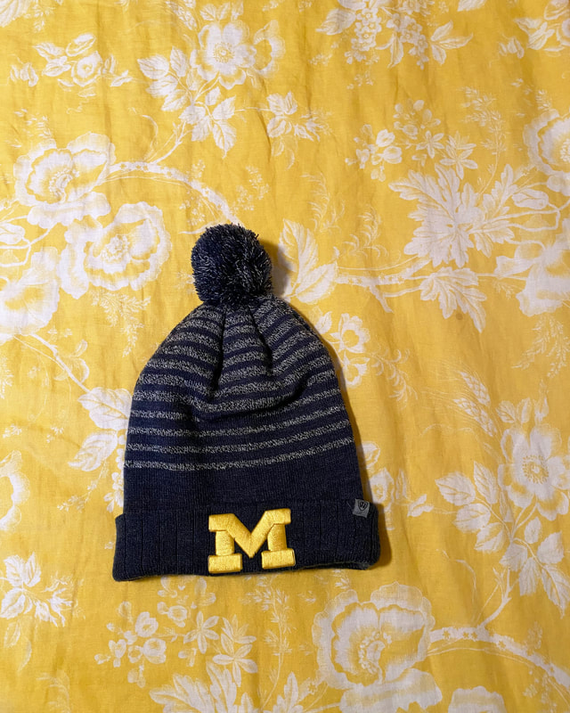
|
A Soft Change
|
Artist Statement
This hat doesn't really have a memory since I got it over winter break but I love wearing it and it shows my home and where I'm proud to be. The photo is taken on my bed in the afternoon. I thought the design of the sheets would look really nice with the hat. Even though it would be nice to have a different color to have it pop but I had enough wall pictures. The pixelation technique was pretty good because you can still make out the details but it isn't as clear. I also liked how the lines in the image got somewhat broken up due to the pixelation.
Holiday Rolls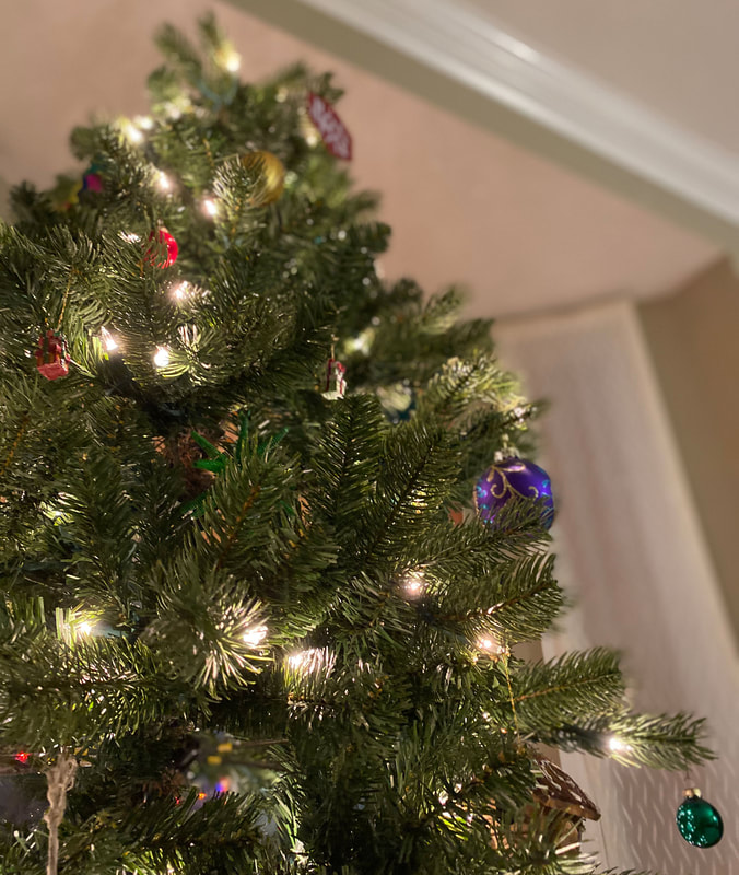
|
The "Real Artificial" Tree
|

Artist Statement
I had to include a seasonal object. I actually had taken this photo the day before it was going to be taken down and I thought it was a great idea to take a picture of it since it is a single tree. This form of pixelation wasn't a great one in my opinion but I made it work. However, I did like the fact that it blurred the outside colors so it looked like it was centering on the object. In fact both images did this trick and I was pleased by the outcome. I thought it was kind of cool how the object provided some light for the image. The memory behind this tree is very special since it has been there since I was about nine and I would be vigorously opening my presents underneath the tree.
Closer View of Character
|
Strings Attached
|

Artist Statement
This object is one that I use very often throughout the week. Surprisingly it is pretty new, I got it about a couple months ago. The photo is taken in a library room in our house which has big windows to allow light. In the first picture you can see how fast the racket grip can wear and I wanted an object that showed some character. I like the angle on the left image which show the details while going up the racket. Luckily for this photo I didn't have any trouble finding an angle to take the photo.
Dream Come True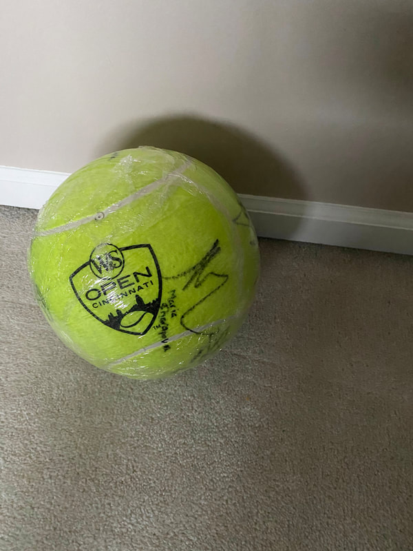
|
A Memory to Never Forget
|
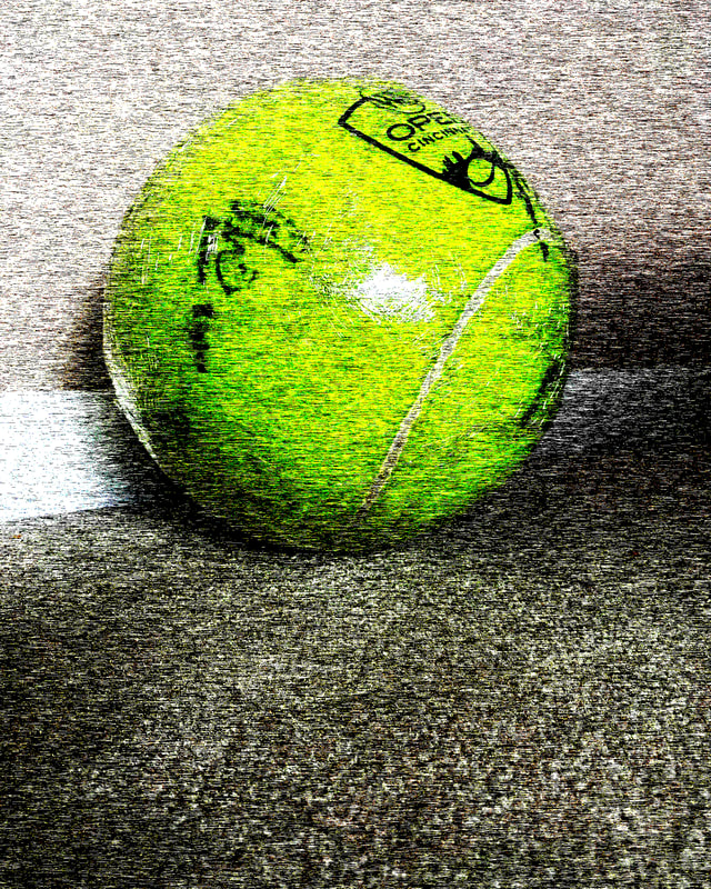
Artist Statement
This ball you see above is not just an ordinary ball I decided to take a picture of. It resembles the experience I had when going to a tournament with my favorite sport. I got to go with the Skyline team and get to see all the top players. I believe the ball has around ten signatures and some of these signatures were from the top 20 players in the world. The pixelation technique I used in the second photo was by far my favorite because it showed all the small color details and the ball just popped out so much. The ball is darker farther away and it gives more white or black to suit the rest of the photo. I did take the photo around noon to get the best natural light I could to see the signatures clearly. It had always been one of my goals to go to a professional tennis tournament and the ball is a token to remember it by. Finding good angles were somewhat of a problem since I was much bigger than it so I would have to move around to find clever angles. I prefer my second angle on the ball since it takes a lover perspective so the viewer is able to perceive depth on the object. Out of all my photo I would say this has the deepest story behind it.
